· 4 min read
The Power of Colors: Crafting the Perfect Color Palette for Your Brand
Guide to choosing the right colors for brand identity and customer engagement

Did you know colors can influence brand perception and customer behavior? Whether it’s the vibrant red of Coca-Cola, the soothing blue of Facebook, or the earthy green of Starbucks, colors have a profound impact on how we perceive brands and interact with them. These aren’t just aesthetic choices - they are strategic decisions rooted in psychology and marketing science.
Color is one of the most powerful tools in a brand’s arsenal. It can evoke emotions, convey messages, and even drive consumer actions. The selection of a color palette is a critical aspect of brand development - one that can make or break your brand’s image in the eyes of your audience.
In this post, we’ll guide you through the fascinating world of color psychology and provide practical tips for creating a color palette that aligns with your brand’s values and appeals to your target audience. We’ll explore the emotional responses different colors evoke, how to select colors that represent your brand effectively, and how to create a harmonious palette that ensures consistency across all your branding materials.

Color: More Than Just Aesthetics
Imagine you walk into a store with bright yellow walls and energetic music. You might feel more optimistic and energized, ready to browse and buy. Now picture a serene spa with soft, calming greens and blues. You’d likely feel relaxed and ready to unwind. These are the powerful, subconscious influences of color on our perceptions.
Think about brands you love:
- Spotify: The vibrant green is associated with growth, energy, and youthfulness, reflecting the dynamic nature of its music streaming platform.
- Target: The bold red conveys energy, excitement, and a sense of urgency, reflecting their focus on affordability and variety.
- Apple: The minimalist use of white and gray reflects simplicity, innovation, and elegance, aligning with their high-quality product image.
These aren’t coincidences; they are strategic color choices that resonate with target audiences and communicate brand values.
Decoding the Emotional Language of Color
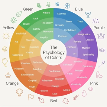
Each color carries its own unique emotional weight, shaping how people respond to it:
- Red: Energy, passion, urgency, excitement. ![Red Bull]insert-red-bull-image-url-here)
- Blue: Trust, stability, calmness, professionalism. ![Microsoft]insert-microsoft-image-url-here)
- Green: Nature, growth, harmony, sustainability. ![Whole Foods]insert-whole-foods-image-url-here)
- Yellow: Happiness, optimism, warmth, creativity. ![Post-It]insert-post-it-image-url-here)
- Purple: Royalty, luxury, mystery, spirituality. ![Hallmark]insert-hallmark-image-url-here)
- Black: Sophistication, power, elegance, mystery. ![Gucci]insert-gucci-image-url-here)
- White: Purity, simplicity, cleanness, neutrality. ![Apple]insert-apple-image-url-here)
Need inspiration? Coolors is a great website to help you pick color palettes.

Crafting a Cohesive Color Palette
When building a brand, choose colors that align with your personality and target audience. A balanced color palette isn’t just visually pleasing, it tells a story.
The 60-30-10 Rule
This classic design principle provides a framework for color harmony:
- 60% Primary Color: The foundation of your brand’s visual identity.
- 30% Secondary Color: Adds depth and complements the primary color.
- 10% Accent Color: Highlights key elements and adds visual interest.
While the 60-30-10 rule is a great starting point, remember that these are guidelines, not hard rules. Every brand is unique, and you might find that different color ratios work better for your specific needs. The key is to always consider the overall balance and harmony of your palette, ensuring that each color plays a purposeful role in conveying your brand’s message.
Ultimately, a well-crafted color palette is a powerful tool for building a memorable brand identity. It goes beyond just aesthetics; it creates an emotional connection with your audience, subtly reinforcing your brand’s values and message.

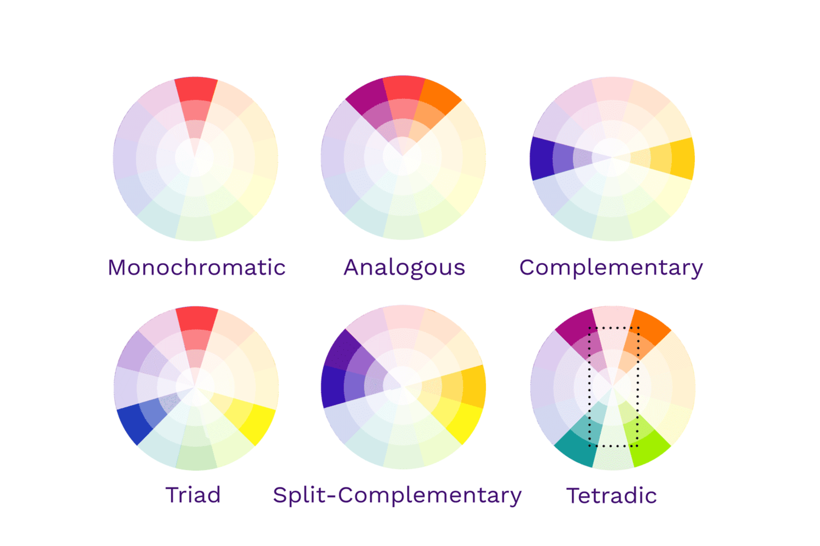
Experiment with Color Schemes
- Monochromatic: Using different shades of a single color for a minimalist and cohesive look.
- Analogous: Using colors adjacent on the color wheel for a harmonious and balanced feel.
- Complementary: Using colors opposite each other on the color wheel for a vibrant and contrasting effect.
- Triadic: Using three colors equally spaced on the color wheel for a balanced and interesting look.

Need more inspiration? Check out 100 color palette examples.
Consistency is Key
Once you’ve chosen your color palette, apply it consistently across all brand materials. This creates a unified brand experience that resonates with your audience and reinforces your message.
- Brand Guidelines: Create a document that outlines your brand’s visual identity, including color codes (HEX, RGB, CMYK), color pairings, and usage guidelines. This will help you maintain consistency across all your branding materials. Consistency should also extend to typography, imagery, and layout, ensuring a cohesive look across all materials.
- Think Beyond the Logo: Apply your color palette consistently to your website, social media profiles, packaging, marketing materials, and even staff uniforms.
The Power of Color is in Your Hands
Color is a powerful tool in brand development. It can evoke emotions, build trust, and drive customer actions. By understanding the psychology of color and applying it strategically, you can create a visual identity that resonates with your target audience, strengthens your brand, and sets you apart in a crowded marketplace.
Now it’s your turn—start experimenting with colors and find the perfect palette that captures the essence of your brand!


