· 8 min read
Logo Magic: The Essentials of Effective Logo Design
Guide to creating a memorable and effective logo

Every successful brand has one thing in common: a powerful logo. It’s the visual cornerstone of your identity, the first impression you make, and the key to building brand recognition. But creating a truly effective logo takes more than just throwing together some shapes and colours.
This guide will walk you through the essential steps to crafting a logo that not only looks great but also resonates with your target audience and effectively communicates your brand’s personality.
Understanding the Power of a Logo
Think of your logo as your brand’s handshake - it introduces you, builds trust, and leaves a lasting impression. A well-designed logo:
- Communicates your brand’s core values: What are you about? What sets you apart?
- Creates instant recognition: People should be able to identify your brand quickly and easily.
- Enhances brand consistency: From your website to your social media, a strong logo unifies your visual identity.
- Adds value and credibility: A professional logo conveys professionalism, trustworthiness, and quality.
Key Design Principles for a Great Logo
Creating an effective logo involves understanding several key design principles:
- Simplicity: A simple logo is easy to recognize and remember, allowing your brand to cut through the noise.
- Memorability: A great logo sticks in people’s minds, making your brand easily recognizable.
- Relevance: Your design should reflect your brand’s values and resonate with your target audience.
- Scalability: Your logo must look great at any size, from a business card to a billboard.
- Versatility: It should work across various formats—color, black and white, digital, and print.
Each of these principles plays a critical role in ensuring that your logo not only looks good but also functions well in every context.

Crafting Your Logo Magic
Now, let’s dive into the key steps to designing a logo that truly shines.
Define your Brand Identity
Before you even touch a design tool, you need to know who you are and what you stand for. Ask yourself:
- What is your brand’s mission? What problem do you solve for your customers? What’s your purpose? What makes your business different and valuable? For example, a mission statement might be “To provide high- quality, affordable education to underserved communities.”
- What are your core values? Are you innovative, reliable, eco-conscious, or community-driven? Are you innovative, reliable, eco-conscious, or community-driven? These values will inform your design choices and help create a consistent brand experience.
- What makes your brand unique? What sets you apart from your competitors? What do you do better than anyone else? This helps you develop a unique selling proposition and create a logo that reflects your distinct personality.
- Who is your target audience? What are their demographics, interests, and aspirations? What message will resonate with them? Think about their age, gender, lifestyle, and values. Understanding your audience is essential for creating a logo that appeals to them.
- How do you want your audience to feel when they encounter your brand? Do you want them to feel inspired, empowered, or relaxed? Consider the emotions you want to evoke and choose design elements that will help you achieve those goals. For example, a logo with bright colors and playful fonts might evoke happiness and excitement, while a logo with sleek lines and a bold font might convey power and authority.
Seek Inspiration
Don’t be afraid to look to others for ideas! Explore logos in your industry and beyond.
- Create a mood board: Gather images, colors, fonts, and styles that resonate with your brand’s personality and desired aesthetic. You can use physical boards or online platforms like Pinterest or Canva. Think about the overall look and feel you want to achieve—modern and minimalist, classic and elegant, or playful and whimsical.
- Analyze your competition: Take a close look at the logos of your competitors. What works well? What could be done better? Identify what makes their logos successful (or unsuccessful) and use this knowledge to inform your own design decisions. Consider what makes their logos memorable, effective, or unique.
- Think about your brand’s visual language: What imagery, colors, or shapes best represent your brand’s core values and message? For example, a technology company might use sleek lines and geometric shapes, while a bakery might use warm colors and hand-drawn illustrations. Think about the visual cues that will connect with your target audience and create a strong visual identity.
Choose Your Design Style
There are endless possibilities when it comes to logo design, but here are some popular styles:
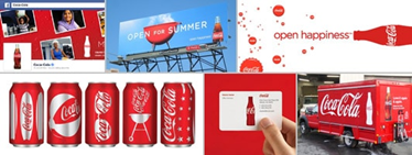
- Classic: This style exudes timelessness and elegance. It often features serif fonts and traditional elements like crests or flourishes. Think of the logos of classic brands like Coca-Cola or Tiffany & Co. It conveys a sense of tradition, quality, and sophistication.
- Modern: This style is clean, minimalist, and contemporary. It often uses sans serif fonts and geometric shapes. Think of companies like Apple or Google. It conveys a sense of innovation, simplicity, and approachability.

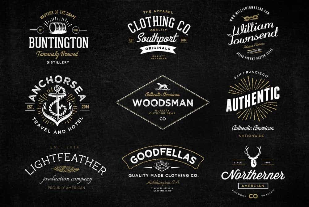
- Vintage: This style evokes nostalgia. It often features hand-drawn elements, distressed textures, and retro color palettes. Think of vintage clothing stores or antique shops. It conveys a sense of history, authenticity, and craftsmanship.
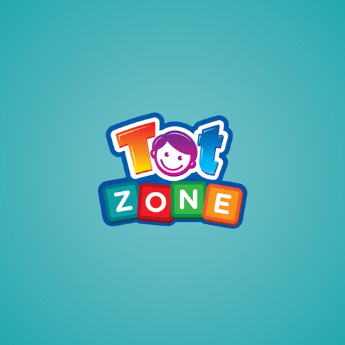
- Quirky: This style is fun, playful, and eye-catching. It often uses bright colors, illustrations, and unique typography. Think of the logos of children’s toy companies or social media platforms. It conveys a sense of personality, energy, and approachability.
Select the Right Type of Logo
There are several common logo types to consider. The best choice will depend on your brand name, industry, and desired aesthetic.
- Lettermark: A logo made up of your brand’s initials (like BBC or CNN). This is a good choice for brands with short, memorable names or for creating a minimalist look. It can be very effective for creating a strong visual identity, especially when paired with a unique font.
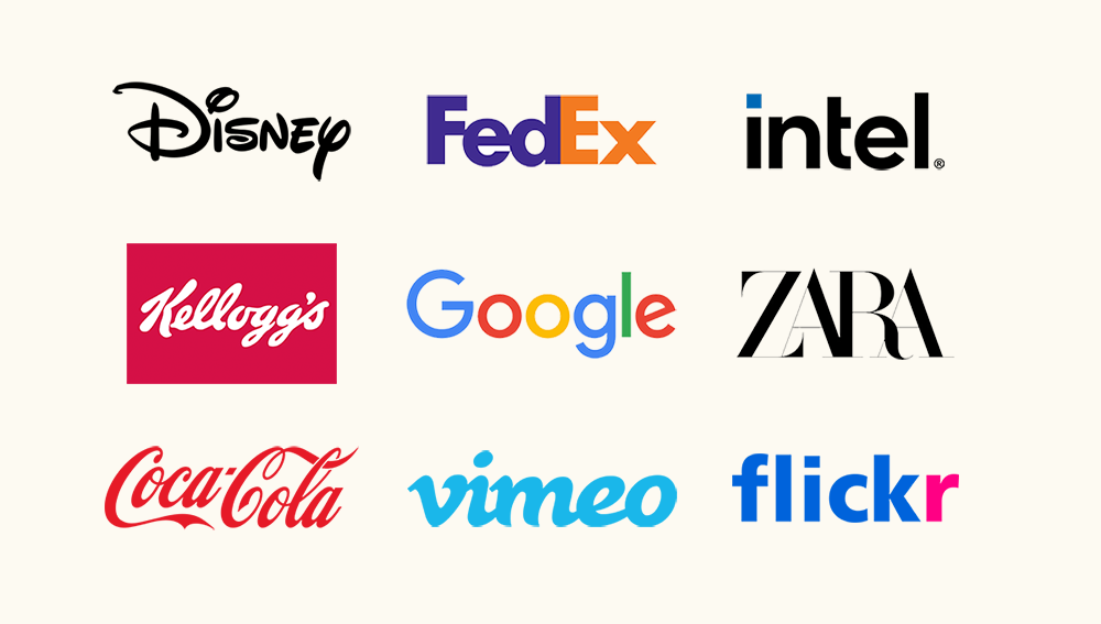
- Wordmark: Your brand name displayed in a unique and memorable font. This is a great option for brands with strong names that are the focus of their identity. It can be a powerful way to showcase the name itself.
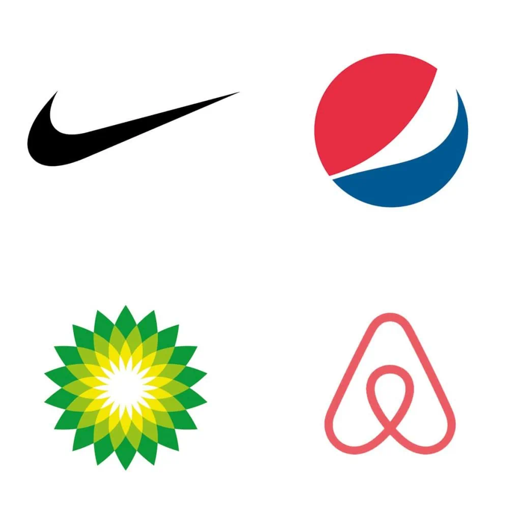
- Pictorial Mark: This is what we think of when we hear the word “logo”. It’s a recognizable symbol representing your brand. This is a good choice for brands that want to create a strong visual identity through a distinctive image. It can be very effective for creating instant recognition.

- Abstract Mark: A logo that uses geometric shapes to create a unique and abstract symbol. This is a good choice for brands that want to create a modern, minimalist, or conceptual feel.
- Mascot: A cartoon character that embodies your brand’s personality. This is a good choice for brands that want to create a friendly, approachable, or playful feel. It can be very effective for connecting with younger audiences or creating a memorable and engaging brand persona.
- Emblem: A traditional logo that often features a symbol enclosed within a frame. This is a good choice for brands that want to convey a sense of history, tradition, or formality. It can be a good way to create a classic and timeless look that feels authoritative and trustworthy.

- Combination Mark: A combination of a wordmark and a symbol or icon. The brand name can be integrated into the main graphic or be placed next to it. People can associate both the logo and your brand name together.
Master the Art of Color
Colors evoke emotions and communicate ideas. Choose colors that align with your brand personality and target audience:
- Red: Energy, excitement, passion.
- Blue: Trust, stability, professionalism.
- Green: Nature, growth, harmony.
- Yellow: Happiness, optimism, creativity.
- Purple: Royalty, luxury, mystery.
- Black: Sophistication, power, elegance.
- White: Purity, simplicity, cleanness.
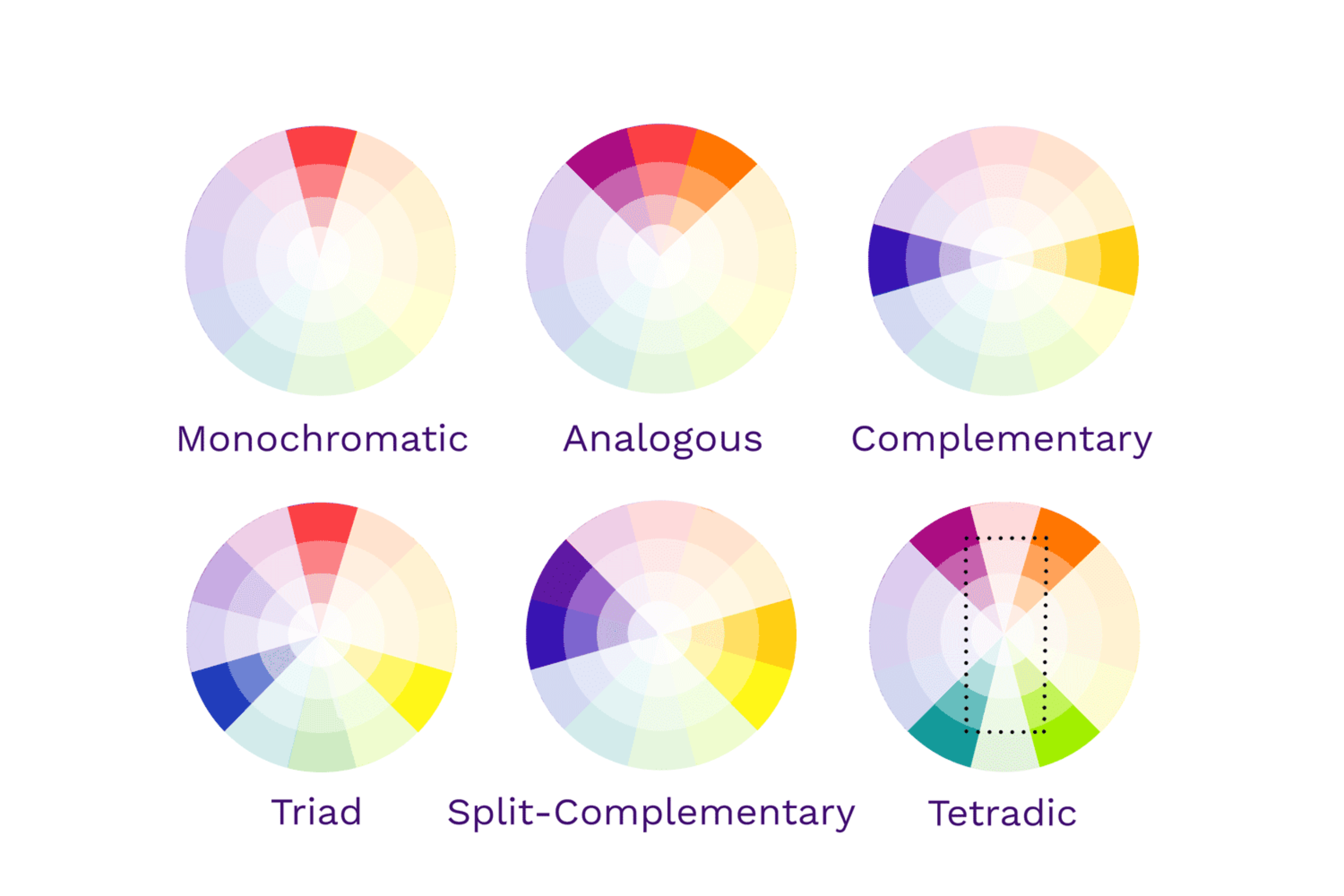
You don’t need to only pick one colour. You can combine several into your logo. Just make sure to pick colours that work well together, by looking at the colour wheel.
Pick the Perfect Typography
Font choice is critical to the overall feel of your logo. There are 6 types of fonts you can pick from:
- Serif: Classic, elegant, and traditional. Good for conveying a sense of history, sophistication, or reliability.
- Examples: Times New Roman, Garamond, Georgia.
- Sans Serif: Modern, clean, and minimalist. Good for conveying a sense of simplicity, innovation, or approachability.
- Examples: Arial, Helvetica, Verdana.
- Handwritten: Casual, personalized, and approachable. Good for conveying a sense of authenticity and personality.
- Examples: Allura, Pacifico, Lobster.
- Script: Elegant, flowing, and handwritten. Good for conveying a sense of luxury, femininity, or personality.
- Examples: Brush Script, Pacifico.
- Display: Bold, decorative, and eye-catching. Good for making a strong visual statement or creating a unique personality.
- Examples: Impact, Chalkboard, Comic Sans.
- Monospaced: Uniform character width, often used for coding or technical applications. Good for conveying a sense of precision, order, and clarity.
- Examples: Courier New, Consolas, Menlo.

Communicate with Your Designer
If you’re working with a professional designer, clear communication is key!
- Provide a comprehensive design brief: Outline your brand’s vision, target audience, style preferences, and any specific design elements you want to incorporate.
- Be open to feedback and suggestions: Trust your designer’s expertise and be open to their ideas.
- Provide clear and detailed feedback: Be specific about what you like and dislike.
Evaluate Your Logo Options
Once you have several logo options, take the time to assess them carefully. Consider:
- Memorability: Is the logo easy to remember?
- Versatility: Can it be used in various sizes and formats?
- Relevance: Does it accurately reflect your brand’s identity?
- Uniqueness: Does it stand out from your competition?
- Timelessness: Will it still be effective in a few years?
Integrate Your Logo into Your Brand
Your logo is the foundation of your entire brand. It should guide your design choices for everything from your website to your marketing materials.
Common Logo Design Mistakes to Avoid:
- Generic Design: Don’t fall into clichés or rely on overused symbols.
- Overly Complicated Designs: Keep it simple for maximum impact.
- Trendy Designs: Trends are fleeting; go for a timeless look.
Your Logo is Your Story
A powerful logo is much more than just a pretty image. It’s the embodiment of your brand’s personality, values, and aspirations. By following these steps, you can create a logo that resonates with your audience and sets your brand apart in a crowded marketplace.


